🔥 Design Webflow sites with AI
Choosing the right font for a logo is one of the most decisive steps in visual identity design. Typography defines perception, communicates tone, and establishes recognition long before color or imagery is processed. For students beginning their journey in design, understanding how fonts function within logos provides a strong foundation for building professional, memorable brand marks. We present a structured, practical, and in-depth guide on how to choose a font for a logo for students to make decisions with confidence and precision.
Typography in logo design operates as a visual voice that defines how a brand communicates its identity. Fonts transmit emotion, personality, and credibility through shape, spacing, and structure, making typography a strategic element for any brand seeking to establish trust and professionalism. Every curve, stroke, and serif contributes to how a brand is perceived across digital and physical environments. For instance, you can see how these elements ensure that the logo of a writing service, EssayShark, appears clear and visually consistent at every touchpoint.
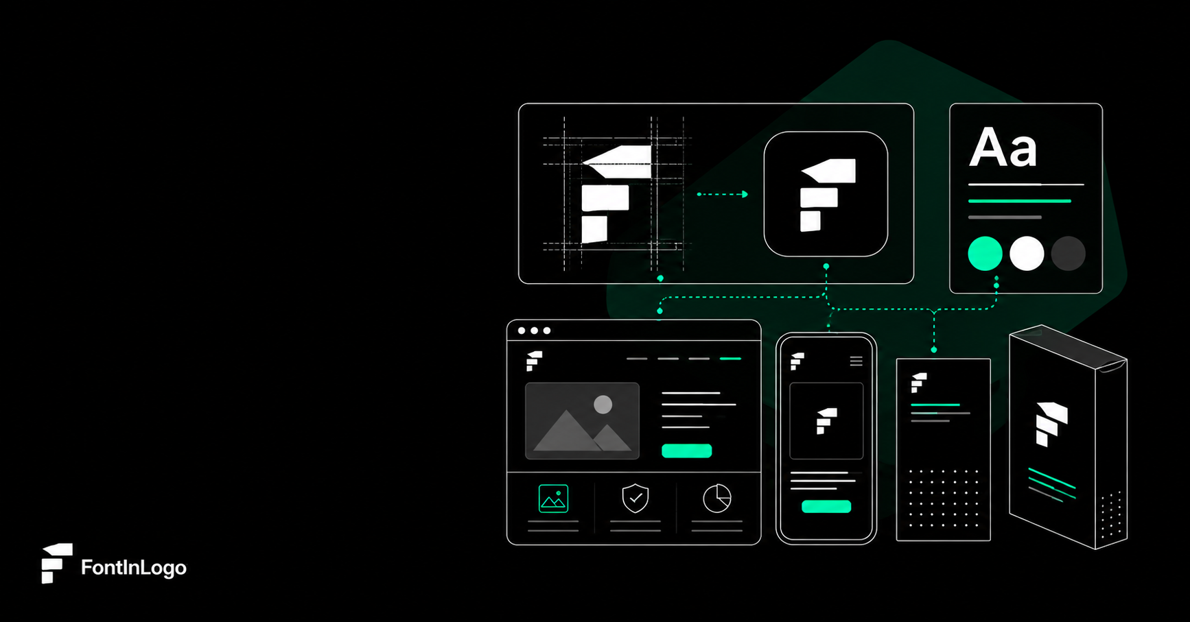
As to the logo font design principles, logos must function at multiple sizes and contexts. Typography determines whether a logo remains legible, distinct, and recognizable on a website header, mobile app icon, packaging, or billboard. Students must treat font selection as a strategic design decision rather than a decorative choice.
A strong grasp of core font categories allows faster and more accurate selection. Each category carries distinct visual signals and functional strengths.
Serif fonts feature small strokes at the ends of letters. They convey tradition, authority, and professionalism. Commonly used in academic institutions, publishing, and heritage brands, serif fonts provide structure and familiarity.
Key characteristics:
Sans-serif fonts eliminate decorative strokes, resulting in a clean and modern appearance. They dominate digital branding due to their clarity and versatility.
Key characteristics:
Script fonts mimic handwriting or calligraphy. They introduce elegance, creativity, and personal expression when used with restraint.
Key characteristics:
Display fonts are highly stylized and designed for impact. They establish a strong visual identity but require careful handling.
Key characteristics:
Font selection begins with clarity around brand attributes. Students should translate abstract brand values into tangible typographic traits.
Professional and corporate brands
Clean serif or neutral sans serif fonts establish trust, stability, and credibility. Balanced proportions and consistent stroke weights reinforce reliability.
Creative and artistic brands
Custom scripts, experimental display fonts, and expressive letterforms highlight originality and imagination. Controlled irregularities add character without sacrificing clarity.
Youthful and energetic brands
Rounded sans serif fonts and playful display types convey approachability and energy. High x-heights and bold weights enhance visibility and impact.
Luxury and premium brands
Thin serifs, high-contrast strokes, and refined spacing communicate exclusivity and sophistication. Simplicity and restraint define premium typography.
A logo font must perform flawlessly across sizes. Students must test typography at extreme scales to ensure consistent clarity.
Essential checks include:
Fonts with excessive ornamentation or compressed forms lose effectiveness when scaled down. Simplicity enhances durability.
Font weight influences visual hierarchy and emphasis. Light weights convey elegance, while bold weights project strength and confidence. Students should evaluate how weight interacts with color, background, and layout.
Contrast considerations:
Weight variation within a font family allows flexibility while maintaining brand consistency.
Students often choose between using existing fonts and creating custom letterforms. Both approaches serve distinct design objectives.
Pre-made Fonts
Custom Typography
Modifying existing fonts through kerning adjustments or subtle alterations bridges accessibility and originality.
Typography quality depends heavily on spacing. Proper kerning and tracking refine appearance and professionalism.
Kerning adjusts the space between individual letter pairs to eliminate visual gaps or collisions. Tracking controls overall letter spacing across words or phrases.
Balanced spacing enhances readability and visual harmony, especially in wordmark logos.
Students frequently encounter pitfalls that weaken logo effectiveness. Awareness prevents costly revisions.
Here are some common mistakes to avoid:
Consistency, clarity, and restraint produce timeless results.
Font evaluation extends beyond the design canvas. Students should simulate real-world usage scenarios to validate choices.
Recommended tests:
Performance across media confirms font suitability.
Some logos incorporate more than one font, especially within brand systems. Pairing must maintain cohesion and contrast.
Effective pairing principles:
Successful pairings enhance versatility without diluting identity.
Fonts are intellectual property. Students must ensure proper licensing before commercial use.
Font sources:
Understanding usage rights protects projects and clients from legal issues.
Hopefully, these tips for choosing logo font will help you transform abstract ideas into visual clarity. Typography defines tone, reinforces recognition, and anchors brand identity. Through structured analysis, informed testing, and disciplined execution, students gain the skills required to create logos that communicate with authority and precision. Thoughtful font selection elevates design from aesthetic appeal to strategic impact.