🔥 Design Webflow sites with AI
Choosing the best font for a mobile app is a technical requirement for user retention. When we talk about font selection, we consider how text looks and reads on small screens. We also check how quickly it renders on slow connections. Designers and developers often face the challenge of users dropping off due to eye strain, especially when cluttered interfaces make navigation difficult.
We selected the fonts in this guide after reviewing the latest UI standards. We checked how these fonts look in real use, including on content-heavy platforms and learning apps, where users read in quick bursts and maintain focus without eye fatigue. The options below help you compare which fonts work for modern mobile interfaces, so let's review the list!
Mobile devices accounted for 58.67 percent of global website traffic by the start of 2025, according to data from the Digital 2025 Global Overview Report. As a result, designing for mobile readability and performance has become increasingly important.
One key aspect of this is typography, where system fonts play a significant role. System fonts are the default typefaces built into the mobile operating system. Examples include:
We found that using these native options removes the need for the device to download external font files. This reduces initial load times, and that is why Google recommends sticking to system fonts for standard UI elements. The operating system handles the weight and spacing adjustments automatically.
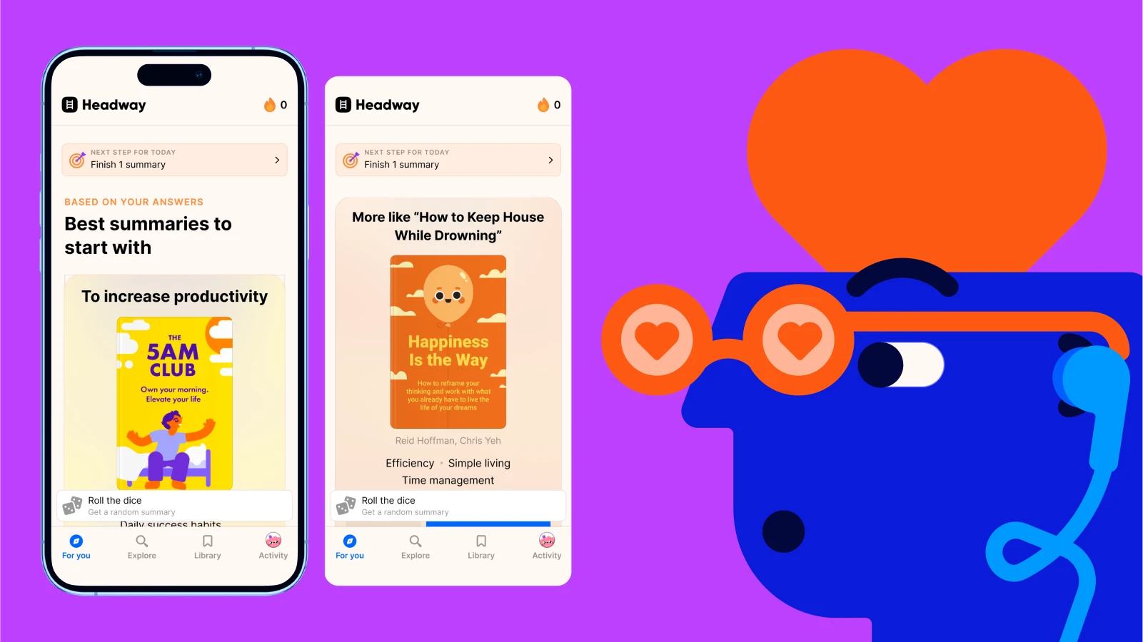
Learning apps typically use clean, modern system fonts that feel native to mobile devices, making the interfaces easy to read and familiar to users. The typography is simple and highly legible, with interactive elements. The clean, rounded look and spacing strongly match San Francisco in particular.
You can use system fonts when performance is critical. This creates a look that feels like a natural part of the phone. Because the system font is already stored on the device, the text appears instantly. This is helpful when you are building sites or apps to make friends, where every millisecond of loading counts.
Fast rendering helps maintain user engagement during social interactions. Using native fonts provides several immediate technical benefits:
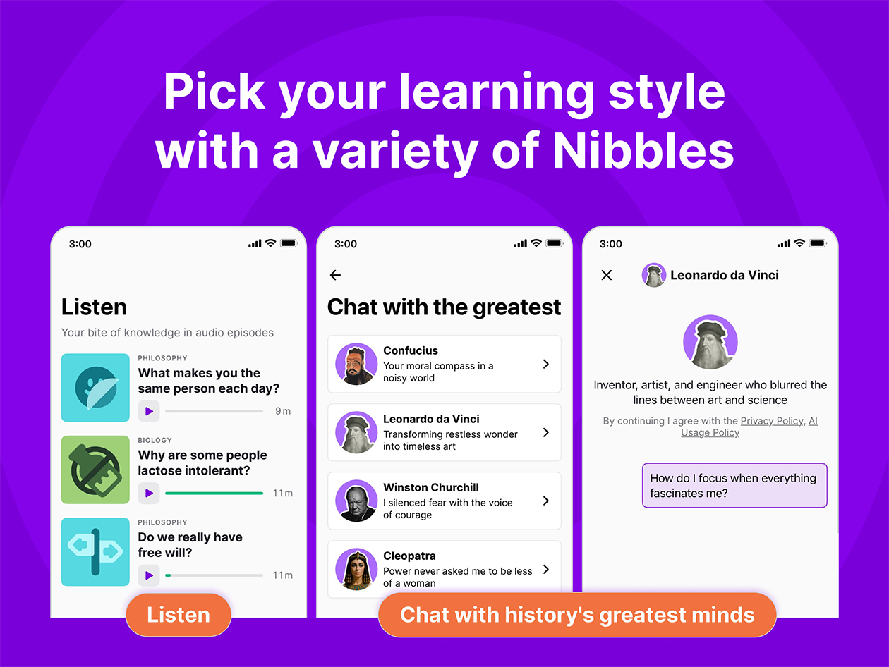
The Google Fonts library is an open-source collection. It provides thousands of typefaces for mobile and web use. We see many developers using this library because it allows for experimentation with different styles without licensing costs. The collection provides data on how different weights affect reading comprehension. This is useful for educational interfaces.
You can browse the library to find fonts that match your brand identity. These fonts maintain technical compatibility across different devices. You can use these fonts during the prototyping phase to see how a specific look affects user interaction. This library is a standard resource for early-stage products. It provides a custom look without a custom price tag.
Inter is a variable font specifically designed for computer screens and mobile displays. We noticed that many SaaS apps choose Inter because it features a tall x-height. This makes lowercase letters easier to read at small sizes.
The design uses specialized glyphs. This prevents characters like lowercase i and lowercase l from looking the same. For example, let's take a basic comparison in plain text. The next letters and numbers may look very similar in some fonts: i l 1. In a poorly optimized font, these three can blur together. You may need extra time to read them. Imagine a username: milani vs. milan1
vs. milanl.
If the font does not clearly separate i, l, and 1, the names can look almost the same at small sizes. Fonts designed for screens add small differences:
You can use Inter when your app has a lot of data or numbers. It keeps the interface clean, even when you have to pack a lot of information into a single view. The font remains sharp on high-resolution retina displays. It also works on older mobile screens.
This makes it a reliable choice for content-heavy dashboards. Developers prefer Inter for specific UI reasons:
Open Sans is a humanist sans-serif typeface designed with an emphasis on neutral open forms. We found that its wide apertures help prevent text from blurring when users scroll quickly. An aperture is the opening in a letter, like a lowercase c or e. It is a common choice for digital publishing.
You use Open Sans when your app features long articles that require the user to spend time reading. Its balanced spacing reduces eye fatigue during extended sessions. This font works well in multi-language apps. It supports a large number of Latin and Greek characters. This makes it versatile for global audiences.
Variable fonts are a single font file that contains multiple variations of a typeface. We found that using one variable font file can reduce the total data the app needs to download. This technology allows the font to stretch or shrink smoothly. It fits any screen width without losing quality.
You can use variable fonts when you need your UI to be highly responsive across different phone models. You can fine-tune the font weight to match the background color. This makes the text easier to see in dark mode. This is a modern approach for developers who want to optimize their app code.
Lato is a sans-serif typeface that combines semi-rounded details with a strong structure. We found that this creates a feeling of warmth, which is helpful for consumer-facing apps. The letters are stable and provide high legibility across sizes. It is often used in travel and lifestyle applications.
You can use Lato when you want your app to feel friendly but professional. It offers a wide range of weights that help you create a clear visual hierarchy. Titles appear sturdy while body text remains light and easy to scan. This balance makes it a favorite for brands that want to build trust with their users.
Montserrat is a geometric sans-serif font inspired by the traditional posters of the Montserrat neighborhood in Buenos Aires. We noticed its popularity in modern minimalist app designs. The wide letterforms give the UI a spacious feel. It is particularly effective for large headlines and splash screens:
Choosing the best font for a mobile app is a balance between how the text looks and how the app performs. The right choice depends on whether you are building for a specific platform. It also depends on whether you are creating a learning tool. Fonts affect how quickly users process information.
You can start by testing a system font to ensure your app loads quickly. You can also experiment with options like Inter or Open Sans for specific content needs. You can check how your chosen font scales when users change their device settings. Try one of these fonts in your next prototype and see how it changes how you interact with the interface!