🔥 Design Webflow sites with AI
Spotting a font you love on a brand's logo, a magazine spread, or a poster — and then having no idea what it's called — is one of the most universal frustrations in design. Identifying a font from an image used to be a slow, manual process. Today, the combination of AI-powered matching tools and a few sharp visual habits can name almost any typeface in minutes.
This guide walks through the seven methods that actually work in 2026, when to reach for each one, and how to verify the result before you commit to using it.
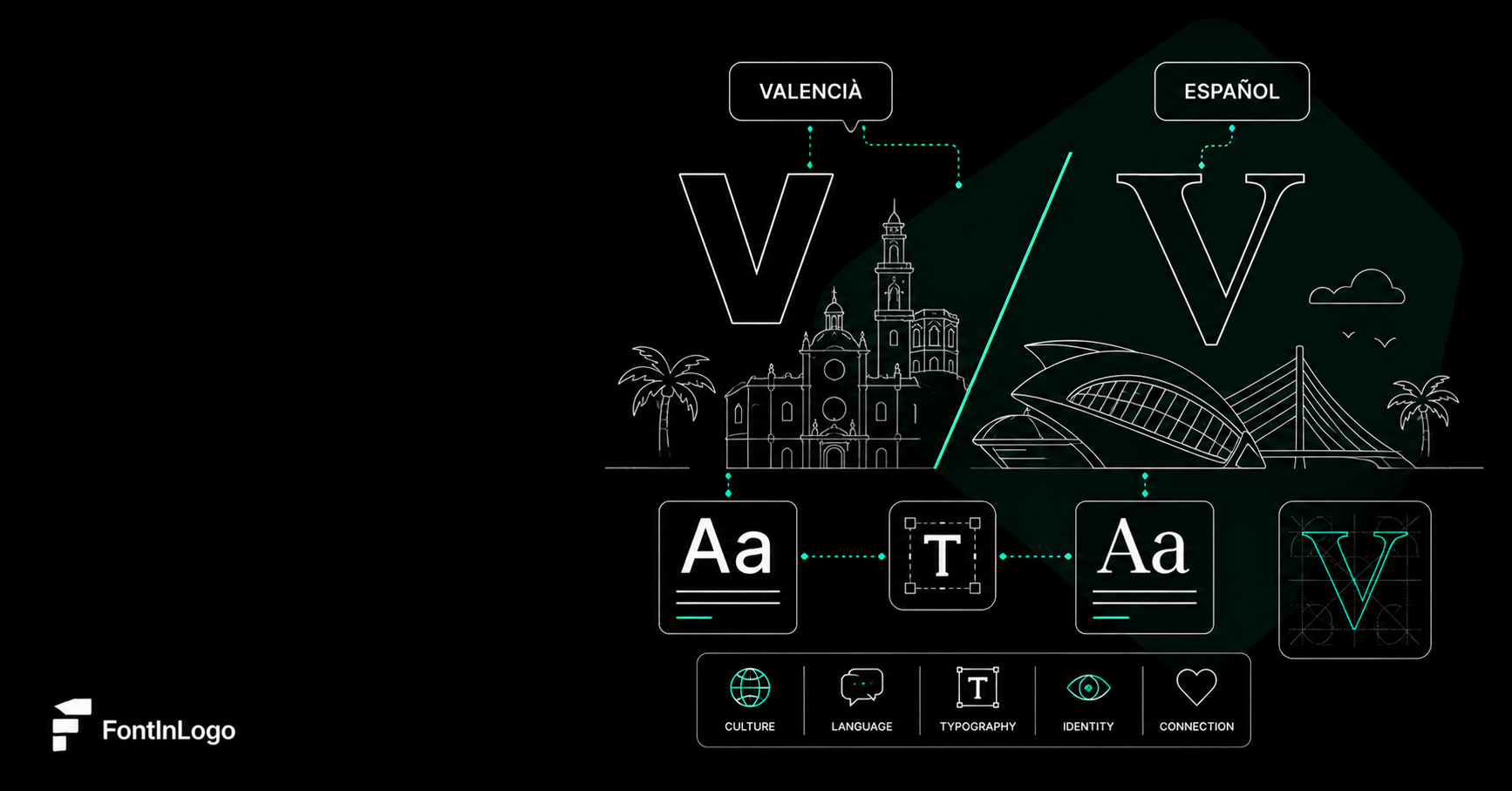
Before getting into tools, it helps to understand why identifying a font from an image is harder than it sounds. Logo fonts are rarely used straight out of the box. Brands modify letterforms, kerning, and proportions to create something distinctive. The Coca-Cola script, the Disney wordmark, and Google's logotype all started as existing typefaces — but the versions on the bottle, the theme park, and the search bar are heavily customized.
This means most font identification tools won't return a perfect match. They'll return the closest match — the typeface a designer most likely started from. That's often what you want anyway, because licensing the original is usually safer and cheaper than trying to recreate the custom version. (For a closer look at how brands modify their logo fonts versus their broader brand typography, see our guide to logo fonts vs brand fonts.)
If the font you're trying to identify is on a well-known brand's logo, the fastest answer is usually a curated database. Font in Logo catalogues the typefaces behind hundreds of major brands — Nike, Tesla, Sony, BMW, The New York Times, Nvidia, and many more — with each entry verified by designers or community submissions. Our companion piece on the 100 most famous logo fonts ever used gives a broader overview if you want to browse rather than search.
Where it shines: recognizable brands. If the logo is famous, the answer is usually one search away, and you'll get the verified typeface name plus context on whether it's the original font or a modified version.
Where it struggles: obscure or local brands won't be in the catalogue. For those, fall back on the visual identification tools above.
Font Squirrel's Matcherator is the free alternative most designers eventually find. Like WhatTheFont, it works from an uploaded image — but the interface lets you select individual characters one by one, which often produces better results for tricky letterforms.
Where it shines: free-to-use, no signup, surfaces both commercial and free fonts in results. Useful when you want to know if a typeface has an open-source alternative.
Where it struggles: a smaller library than WhatTheFont, so very obscure typefaces may not appear at all. The character-by-character interface also takes longer than a single upload.
If the font you're trying to identify is on a sign, a book cover, or a printed brochure rather than a digital image, Adobe Capture on iOS and Android is hard to beat. Point your phone's camera at the lettering, and the app uses Adobe Fonts' library to identify the closest match in real time.
Where it shines: photographs, signage, packaging, anything in the physical world. The auto-correction for camera angle and lighting is genuinely good.
Where it struggles: matches are limited to fonts in Adobe's library — so if the typeface is from another foundry, you'll get a near-match suggestion instead of the actual font.
Identifont takes a completely different approach: instead of analyzing an image, it asks you a series of yes-or-no questions about specific letterforms ("Does the lowercase 'a' have a curved tail?"). After 10 to 20 questions, it produces a ranked list of candidates.
Where it shines: situations where you can see the typeface but can't easily upload it — for example, you're describing a font you saw at a client meeting from memory, or the image is too low-resolution for visual matching to work.
Where it struggles: the database hasn't kept up with newer typefaces. If the font is post-2015, Identifont may not know it. It's also slower than visual matching when an image is available.
WhatTheFont, run by MyFonts, is the most popular automated font identifier on the web. Upload an image, crop tightly around the letters you want to identify, and the tool returns a ranked list of typeface candidates with similarity scores.
Where it shines: clean, high-resolution images of standard sans serif and serif typefaces. If the image is sharp and the font isn't heavily stylized, WhatTheFont will usually nail it within the top three results.
Where it struggles: heavily customized wordmarks, scripts, distressed or grunge fonts, and very low-resolution images. It also leans toward fonts available on MyFonts — so an open-source font might appear as a paid alternative even when a free version exists.
This is the technique most designers forget. Take the logo or image, drop it into Google Lens or TinEye, and let the reverse image search do the heavy lifting. You won't get a font name directly, but you'll often find the original brand or a designer case study that mentions the typeface by name.
Where it shines: finding the source of an image. If you're trying to identify a font on a Pinterest screenshot or a stock photo, reverse image search will often lead you to the original page where the font is named in the metadata.
Where it struggles: requires the image to have been published somewhere indexable. Won't work for private mockups or original photos.
None of the tools above are perfect, and there's still no substitute for a trained eye. Designers who study typography learn to recognize fonts the way sommeliers recognize wines. A few habits that make manual identification dramatically faster:
• Look at the lowercase 'a' and 'g'. These two letters carry the most distinctive variation across typefaces. Single-storey vs double-storey 'a', open-loop vs closed-loop 'g' — these details narrow the field instantly.
• Check the terminals. The way strokes end — flat, angled, hooked, ball-shaped — is one of the strongest signals of which family a typeface belongs to.
• Watch the contrast. The difference between thick and thin parts of letterforms tells you whether you're looking at a Didone (high contrast), a Garalde (moderate), or a slab serif (almost none).
• Notice the x-height. Modern sans serifs typically have a tall x-height; classical serifs are shorter. This alone often separates two visually similar candidates.
The more time you spend studying real type specimens — through resources like Font in Logo, Fonts In Use, or your own collection — the faster manual identification becomes.
Once a tool gives you a candidate font, don't trust the result blindly. Verify the match before licensing or using the typeface.
The fastest verification method is to type out a few distinctive words from the original image in the suggested font and compare side by side. Look at characters that vary most across typefaces: lowercase 'a', 'g', 'e', 'k', and the numerals 1, 4, and 7. If those match, you've almost certainly got the right font — or a close enough variant for your purposes.
If the original logo uses heavily customized letterforms, accept that you're licensing the closest typeface, not the exact one. That's how the real designers who created the wordmark started, too.
The honest answer is that no single tool wins every situation. For speed and accuracy on a digital image, start with WhatTheFont. For real-world photos, Adobe Capture is hard to beat. For famous brand logos, search Font in Logo first. And when nothing else works, the manual eye — paired with a good understanding of typeface anatomy — is still the most reliable identifier of all.
The fastest workflow most professional designers use is a combination: try a visual matching tool first, fall back to a curated database if the brand is recognizable, and verify the result manually before committing to a license. Font identification is no longer the slow, frustrating process it used to be — but the best results still come from knowing which tool to reach for, and when.


.avif)