🔥 Design Webflow sites with AI
The most popular fonts used in logos include Helvetica, Futura, Gotham, Avenir, and Univers. These typefaces appear across hundreds of global brands because they are clean, versatile, and built for legibility at every size. Whether you're a designer researching typefaces or a brand owner trying to understand what makes logos work, this guide covers the most important logo fonts, the brands that use them, and why they dominate modern identity design.
In this guide you will find:
Quick Answer: The most common fonts used in logos include Helvetica, Futura, Gotham, Avenir, and Univers. These typefaces are widely used because they are clean, modern, and highly legible across print and digital formats.
Typography is one of the most consequential decisions in brand identity. According to research published by the MIT AgeLab, legibility and recognition are closely tied to typeface geometry — a key reason why geometric and neo-grotesque sans serifs have dominated logo design for decades. When a font is used consistently across a brand's touchpoints, it becomes part of the brand's recognition system itself.
Helvetica is the closest thing typography has to a universal language. Created in 1957 by Max Miedinger and Eduard Hoffmann at the Haas Type Foundry in Switzerland, it was designed to be as neutral and readable as possible. That neutrality is its superpower.
Its strokes are clean, its spacing is tight, and it carries almost no stylistic personality of its own — which means it takes on the personality of the brand using it. That's why you find it across industries as different as aerospace, automotive, and fast food.
Famous logos using Helvetica include:
Why Helvetica works for logos: It scales perfectly from a business card to a billboard. It doesn't distract from what's being communicated. And it carries a subtle sense of authority — which is why American Airlines, Toyota, and dozens of Fortune 500 companies have chosen it as the backbone of their visual identity.
Helvetica alternatives worth considering: Arial (free, widely available), Neue Haas Grotesk (the direct revival), and Inter (a popular open-source choice for digital branding).
Futura is built on pure geometry. Designed by Paul Renner in 1927, it draws on circles, triangles, and lines rather than historical calligraphy. The result is a typeface that feels forward-thinking even nearly a century after its creation.
Futura's uppercase letters are particularly strong in logo contexts. The near-perfect circles of its O, C, and G, combined with sharp diagonal strokes in letters like A and V, give it a visual energy that few fonts can match.
Brands that have used Futura in their logos:
Futura is also used extensively in editorial and advertising contexts — it appeared in the NASA mission plaques left on the Moon during the Apollo program, a testament to how universal and timeless the design is.
Why Futura works for logos: Its geometry communicates precision and confidence. It also has exceptional optical balance, meaning individual letters sit evenly next to each other without awkward spacing.
Futura alternatives: Avenir (more humanist, slightly softer), Montserrat (free, widely available), and Poppins (digital-native geometric sans).
Gotham is the font that helped elect a president. Designed by Tobias Frere-Jones in 2000 for GQ magazine, Gotham was built on the lettering of mid-century American signage — the painted storefronts, airport terminals, and municipal buildings of the 1940s and 50s.
Its 2008 moment came when Barack Obama's campaign team chose Gotham as the official typeface for a historic presidential run. That visibility launched Gotham into a new tier of cultural recognition and corporate adoption.
Gotham is geometric but warmer than Futura. Its lowercase letters in particular have a friendliness that makes it more approachable in brand contexts where pure authority might feel cold.
Brands using Gotham in their logos:
Today, Gotham appears in everything from university branding to healthcare systems. Its legibility and warmth make it one of the most versatile corporate fonts available.
Gotham alternatives: Montserrat (free, very close structurally), Proxima Nova (a hybrid of Futura and Helvetica proportions), and Circular (used by Spotify itself in its newer branding).
Avenir means "future" in French, and the typeface earns the name. Designed by Adrian Frutiger in 1988, Avenir blends the geometric discipline of Futura with the humanist warmth of typefaces shaped by hand lettering. The result is a font that feels modern without feeling cold.
Where Futura can sometimes feel mechanical, Avenir breathes. Its letterforms have subtle optical corrections that make text easier to read for longer stretches — a quality that makes it work for both logo wordmarks and body copy within brand systems.
Brands using Avenir:
Why Avenir works for logos: It's versatile enough to work in almost any industry. It reads as modern without being trendy, which means it ages well. It also has an unusually large type family, giving designers flexibility across weights and contexts.
Avenir alternatives: Nunito (rounded, free), Lato (humanist geometry, free), and Gill Sans (classic British humanist sans).
Univers was designed as a system, not just a font. Created by Adrian Frutiger in 1957 — the same year as Helvetica — Univers introduced a revolutionary concept: a unified family of typefaces organized by a numbering system that denoted weight and width. Designers could use multiple styles and know they would work harmoniously together.
Univers is a neo-grotesque sans serif, meaning it takes the grotesque tradition (irregular letter spacing, slight humanist quirks) and refines it into something more systematic and neutral.
Brands using Univers:
Univers remains one of the most complete typeface systems ever designed, with dozens of variants from ultra-light to ultra-bold and condensed to extended.
Univers alternatives: Aktiv Grotesk (a contemporary revival), Neue Haas Grotesk, and Acumin.
The dominance of sans serif fonts in modern logo design isn't accidental. It reflects a series of practical decisions that accumulate across platforms, sizes, and reproduction methods.
Most brands use sans serif fonts because they are:
Highly legible at small sizes. When a logo appears as a favicon, app icon, or embroidered patch, the absence of serifs means there are fewer details to lose. Sans serifs tend to hold their form better at small scales.
Scalable across digital platforms. Screens render at various resolutions. Serif details that look elegant in print can appear as visual noise on lower-resolution displays. Sans serifs avoid this problem entirely.
Neutral and timeless. Serif typefaces often carry historical or cultural associations — Times New Roman reads as journalistic, for example, while Garamond reads as literary. Sans serifs are more culturally neutral, making them easier to deploy across global markets.
Easy to adapt for brand identity. Most major brands commission custom typefaces based on sans serif foundations. Starting with a well-established sans serif gives type designers a clean, neutral base to customize.
Geometric sans serif (Futura, Avenir, Montserrat): Built on mathematical forms. Communicates precision, modernity, and confidence. Common in tech, fashion, and luxury branding.
Neo-grotesque sans serif (Helvetica, Univers, Arial): Refined from 19th-century grotesque typefaces. Extremely neutral. Common in corporate, financial, and industrial branding.
Humanist sans serif (Gill Sans, Frutiger, Myriad): Retains proportions from calligraphic tradition. Feels approachable and warm. Common in healthcare, education, and lifestyle branding.
Beyond the five major typefaces, a number of fonts appear repeatedly across well-known brand identities. Each occupies a slightly different position in the spectrum from neutral to expressive.
Proxima Nova is a hybrid designed by Mark Simonson that combines the geometry of Futura with the proportions of Helvetica. It's one of the most popular web fonts in the world and appears in countless startup and tech logos.
DIN (Deutsches Institut für Normung) was originally designed for German industrial standards. Its utilitarian heritage gives it a functional, industrial feel that works well in automotive and engineering contexts.
Frutiger was designed by Adrian Frutiger for the Charles de Gaulle Airport in Paris and is one of the most legible typefaces ever created for wayfinding. Brands in transport, healthcare, and public services frequently use it.
Avant Garde Gothic was designed by Herb Lubalin for Avant Garde magazine in 1968. Its distinctive interlocking letterforms give it a bold, graphic character. It appears in media and arts-adjacent branding.
Trade Gothic is a condensed grotesque with a utilitarian feel. It appears in newspaper headlines and sporting contexts, including several professional sports team wordmarks.
Franklin Gothic is an early 20th-century American grotesque that reads as solid and dependable. It's particularly common in editorial and news contexts, including USA Today's logo.
Optima bridges the gap between serif and sans serif — its strokes flare slightly at the terminals without forming full serifs. It communicates elegance and is used by several luxury brands.
Gill Sans is the classic British humanist sans, designed by Eric Gill in 1928. It's warm, versatile, and closely associated with the BBC and British public institutions. See the BBC logo font for a well-known example.
Typography choices aren't random. Within industries, clear patterns emerge that reflect both practical needs and cultural expectations.
Luxury fashion tends toward geometric or custom serif typefaces. Chanel, Gucci, Versace, and Dior all use elegant, high-contrast lettering that communicates refinement.
Automotive brands split between two poles. Performance-focused brands like Ferrari and Lamborghini use sharp, angular type. Premium European brands like Audi and Mercedes-Benz lean on clean sans serifs that communicate engineering precision.
Tech companies have largely converged on humanist and geometric sans serifs. Google, Spotify, Slack, Stripe, and Shopify all use approachable, modern sans serifs.
Sports organizations often use bold condensed typefaces or custom lettering. The NBA, Premier League, Champions League, and La Liga each use type that communicates energy and competition.
Fast food and retail favor bold, approachable lettering. McDonald's, Burger King, KFC, and Subway all use high-contrast, immediately legible wordmarks.
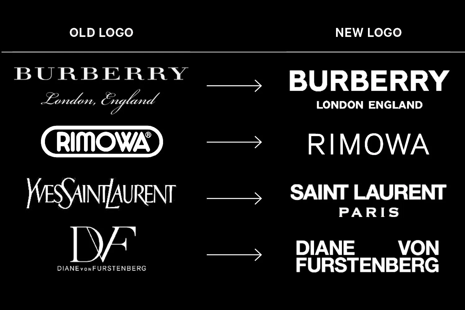
Many of the world's most recognized logos don't use off-the-shelf typefaces at all. As brands grow, they often commission custom typefaces built specifically for their identity system.
Google uses Product Sans for its wordmark — a custom geometric sans designed in-house. Netflix uses a custom version of Graphique. Amazon has its own custom logotype. Samsung uses Samsung One, developed with Monotype.
Custom typefaces offer three key advantages. They prevent any other brand from using the exact same type. They allow for precise control over letter spacing, weight, and character design. And they can be optimized for specific use cases — screen rendering, signage, small print — that off-the-shelf fonts may not handle equally well.
According to Monotype's annual font report, interest in custom typeface commissions among major corporations has grown steadily over the past decade, with more brands viewing their typeface as proprietary IP rather than a design choice.
One of the most common searches in the typography space is finding free or more accessible alternatives to premium logo fonts. Here's a practical breakdown.
Helvetica alternatives:
Futura alternatives:
Gotham alternatives:
Univers alternatives:
While sans serifs dominate, several major brands use serif typefaces to powerful effect.
The New York Times uses Old English lettering — a blackletter, technically — that communicates heritage and journalistic authority. Rolex uses a classic serif that speaks to tradition and precision watchmaking. Vogue uses Didone-style lettering with extreme contrast between thick and thin strokes, which communicates high fashion.
In these cases, the serif is doing specific cultural work. It's signaling history, authority, exclusivity, or tradition — things that a neutral sans serif cannot communicate as directly.
Choosing a logo font comes down to five questions:
What emotion should your brand communicate? Geometric sans serifs feel modern and precise. Humanist sans serifs feel warm and approachable. Serifs feel established and authoritative. Slab serifs feel bold and confident.
Who is your audience? A font that reads as premium to one demographic may feel cold to another. Research what typefaces are already trusted in your industry.
Where will the logo appear? Digital-first brands need fonts that render cleanly at small sizes. Print-focused brands have more latitude. Consider the most extreme use case — a favicon, a billboard, an embroidered hat.
What are your competitors using? Differentiation matters. If every competitor uses a geometric sans, a humanist sans or a custom serif may stand out.
Will you need a full type family? Logo fonts often need to extend into broader brand typography systems. A typeface with many weights, styles, and language support will serve better long-term.
What is the most popular font used in logos?Helvetica is widely considered the most commonly used font in corporate logo design. Its neutrality and legibility have made it the default choice for major brands across industries for over 60 years.
What font does Nike use in its logo?Nike has used Futura Bold in various contexts, particularly in early branding. The Swoosh itself is the dominant visual element, but Futura has been the primary typeface in Nike's wordmark treatments.
What font does Google use?Google's logo uses Product Sans, a custom geometric sans serif designed by Google's in-house team and inspired by the proportions of classic geometric typefaces like Futura.
What font does Supreme use?Supreme's iconic box logo uses Futura Bold Oblique, set in white on a red box. This specific combination has become one of the most recognized — and most imitated — logo treatments in streetwear culture.
Are serif fonts bad for logos?No. Serif fonts can be very effective for logos when the brand needs to communicate heritage, authority, or luxury. Rolex, The New York Times, and Vogue are all excellent examples of serifs used effectively in iconic logos.
What is the best free font for a logo?Montserrat is frequently cited as the best free alternative for logo design. It's available on Google Fonts, closely mirrors the proportions of Gotham and Futura, and has a large enough type family to serve a full brand system.
What font does Spotify use?Spotify currently uses Circular, a geometric sans serif by Lineto. Earlier versions of the brand used Gotham. Circular is also used by Airbnb in its evolved identity system.
What font does Louis Vuitton use?Louis Vuitton uses a Futura-based custom typeface. The all-caps wordmark with tight letter spacing is a defining element of the brand's visual identity.
What is the difference between Helvetica and Arial?Arial was designed by Robin Nicholas and Patricia Saunders for Monotype in 1982 as a metric-compatible substitute for Helvetica. The letterforms are very similar, but Helvetica has slightly more refined details. Helvetica is a premium typeface; Arial is free and bundled with most operating systems.
What fonts do car companies use in their logos?Car companies vary widely. BMW and Jeep use Helvetica-influenced type. Audi uses a custom version of Audi Type. Volkswagen uses Futura-influenced lettering. Ferrari and Lamborghini use sharp, custom display type.
Do brands own their logo fonts?Off-the-shelf fonts like Helvetica or Futura are licensed, not owned. Many major brands commission custom typefaces that they do own as proprietary assets. Samsung, Amazon, and Google all have custom typefaces developed exclusively for their brand systems.
What fonts are used by fashion brands?Luxury fashion brands tend to use either custom serifs or geometric sans serifs. Chanel and Dior use elegant custom lettering. Zara and Calvin Klein use clean, minimal sans serifs. Versace and Gucci use distinctive display letterforms closely tied to their heritage.


.png)